The Ancestry Insider: Indexing Tips: 1900’s American Handwriting
To the young person attempting to read cursive handwriting for the very first time, or after only a brief study in school, indexing cursive documents can be difficult. In this and subsequent articles, I present handwriting styles from different eras.
Twentieth Century Handwriting Samples
First, here are several popular handwriting styles of the twentieth century. Because these are printer fonts, they don’t show if some letters have multiple, acceptable forms.
- The Palmer Method was developed by Austin Norman Palmer around 1888 and was introduced in the 1894 book Palmer’s Guide to Business Writing. The Palmer Method became the most popular handwriting system in the early 1900s. More than a prescribed set of glyphs, the method described the proper body, shoulder and hand movements as well as the proper teaching method. At the time of his death in 1927, over 25 million Americans had learned the Palmer Method of penmanship.
Classic Palmer (shown below) is slanted with large and small ornamental loops. New Palmer has slight variations such as a large loop around the vertical stroke on the B. Q looks like a 2. The F is one looping stroke. (New Palmer F matches the T.) T has a full vertical stroke across the top. Unlike M, N, U and V, W is pointy. Classic Palmer allows the r illustrated as well as the r used by most cursive scripts today.
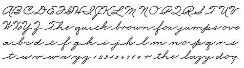
Classic Palmer script illustration courtesy Educational Fontware, Inc. - Zaner-Bloser script was designed by Charles Paxton Zaner (1864-1918) and was initially taught at the Zanerian Business College. Zaner-Bloser accounts for about 40% of handwriting texts in America today. Traditional Zaner-Bloser (shown below) is slanted with little ornamental loops on many uppercase characters like C, E, H and K. Q looks like a 2. F and T have full, vertical top strokes. W is pointy. (Simplified Zaner-Bloser has few loops. Q looks like a printed Q. W is rounded like M, N, U and V.)
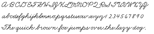
Traditional Zaner-Bloser script illustration courtesy Educational Fontware, Inc.
Please excuse the poor connectors between some letters such as lmn uv and others. - D’Nealian script was introduced in 1976 and already accounts for 40% of textbook sales. It is named after its inventor, Donald Neal Thurber and uses a slanted form with few ornamental loops. Q looks like a 2, F and T have a full horizontal top stroke and M, N, U, V and W are rounded rather than pointed. While some cursive scripts allow breaks between certain letters, D’Nealian is fully linked.
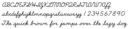
D’Nealian Script illustration courtesy Educational Fontware, Inc. - Harcourt-Brace is slanted and curvy but has few ornamental loops. Q looks like a 2, the vertical top strokes of F and T extend only to the left and W is rounded rather than pointed.
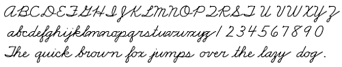
Harcourt-Brace Script illustration courtesy Educational Fontware, Inc.
Please excuse my poor connectors between some letters such as lmn and yz.