American Airlines debuts new logo and livery
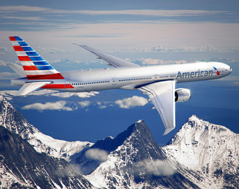
News: American Airlines has unveiled a new logo and livery for its aircraft, designed by brand consultancy FutureBrand.

FutureBrand has simplified the American Airlines eagle into a slim diagonal logo, with the bird’s white head appearing between red and blue wings.
The aircrafts’ bodies will be painted pale silver, with red and blue stripes on the tailfin evoking the American flag. About a quarter of the fleet, or between 150 and 200 aeroplanes, will have the new design by the end of 2013.

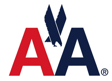
Massimo Vignelli, the designer who created the airline’s outgoing logo, told BusinessWeek he wasn’t keen on the new design. “It has no sense of permanence,” he said. “There was no need to change. Every other airline has changed its logo many times, and every time was worse than the previous one.”

Above: the previous logo, designed by Vignelli
Vignelli also noted that FutureBrand had replaced the Helvetica font the carrier had used since 1967. “We used Helvetica, which was brand new at the time,” he said. “It looked great. The typeface was great. We proceeded by logic, not emotion. Not trends and fashions.”
FutureBrand has also been working with the airline to produce web and mobile apps, airport lounges and onboard menus and branding.
Last year we reported that Finnair had decorated its aircraft with a floral print from Finnish design brand Marimekko and also showed Priestmangoode’s design for a first-class cabin with sofas and wardrobes, and the longest flat business-class bed ever made by Pengelly Design.
See more stories about graphics »
See more stories about transport »
Here’s some information from Futurebrand:
American Airlines & FutureBrand Partner to Create a Modern New Look for the Iconic Brand
With the launch of a refreshed look and livery for American Airlines, FutureBrand is proud to announce our ongoing partnership with this truly iconic brand. Recognising that it was time for a new look to better reflect the progress it had made in the ongoing modernisation of the airline, American engaged FutureBrand to partner on the modernisation of the logo, livery and overall look and feel of the customer experience.
Our work is inspired by the company’s heritage and incorporates colours and symbols universally associated with the American brand. A reimagined logo — called the Flight Symbol — evokes the star, “A”, and iconic eagle of American’s past, all brought to life in refreshed shades of red, white and blue. Together, they reflect a more modern, vibrant and welcoming spirit.
The logo debuts along with a boldly reimagined livery. With proud stripes and a timeless silver body, the livery expresses American’s origins but also the spirit of modern America: innovative, progressive and open to the world.
During our multi-year collaboration with American, we’ve extended the new look to the broader customer experience — on web and mobile apps, modernised airport terminals and check-in experiences, premium airport lounges, updated onboard menus and communications, as well as a host of new branded elements. We continue our work with American as they continue their journey to modernise.


